|
|
Lesson 6: 20th Century artists who use symmetry to explore color theory, part II |
|
Lesson 1 Ritual Geometry Mandala Lesson 2 Group Elements Color Theory Lesson 3 Groups and Groups Acting on Sets Block printing Lesson 4 Klimt and the Computer Color and symmetry in modern art I Lesson 5 Islam Islamic art Lesson 6 Penrose and Rice Color and symmetry in modern art II Lesson 7 Escher 1 Escher 2 Lesson 8 Hundertwasser & Griffeath Pattern and Modern Painting Brian P. Hoke: Cellular Automata and Art Student's Work

|
Exploration of color interaction and symmetry through the work of an Op artist
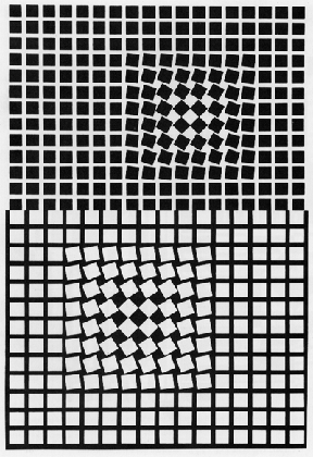
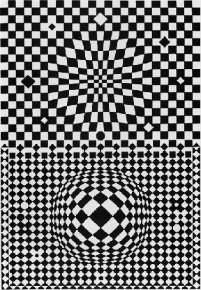
Goals: 1) to become familiar with Op art. Victor Vasarely, Hungarian-French 1908. As a young artist in 1928, Victor Vasarely studied at the Bauhaus school in Budapest, fully identifying with the geometric Constructivist style. [note 1] He emigrated to France in the 1930s, and in the 1950s, became a leader in the European Op art movement. Op artists contrasted saturated colors or black and white to create optical illusions that vibrated with after-images. [note 2] They explored the motion and energy of optical effects with the same degree of thoroughness that Albers had investigated color. [note 3, note 4] While these vibrating designs gained avid media attention in the US, American critics were slow to admit Op art into their canon of "High Art". [note 5] However, in France, European Constructivism permeated many art movements because of its social idealism. Op artists such as Vasarely saw optical art as an egalitarian tool for the 20th Century. [note 6]
Eridan-III 1956 Oil
In his early work Vasarely experimented with the tromp d'oeil effects of such subjects as zebras and checker boards. [note 7] He moved on to develop "plastique cinetique" or "mathematically controlled [abstract] forms and colors" that he endlessly arranged and rearranged into diverse patterns. [note 8]
Vega-II 1957-59 Oil
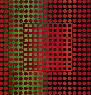
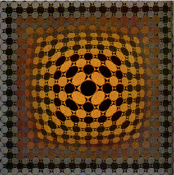
Vasarely used circular, oval, triangular, or square shapes in complex grids to create powerful optical pieces. When a shape deviates from the pattern, it produces a sense of movement, receding and advancing from the picture plane. Graduating values create a smooth progression across the plane, while complementary colors form abrupt shifts. [note 9]
Zett, 1966 Vinyl Museum of Contemporary Art, Montreal
Vasarely referred to these geometric modules, and the infinite variety of patterns they created, as "planetary folklore." He envisioned that technology itself would disseminate this art form, rather than individual artists. Units of abstract shapes and colors alone would create uplifting environments for mankind. In this way, Vasarely sees geometric abstraction as a democratic influence "free of psychological associations."
Museum of Contemporary Art, Montreal
Vega-JG, 1967 Vinyl
How is the work of Vaserely similar to the work of Albers? The rest of this class is spent on sketches for homework, Assignment 4.
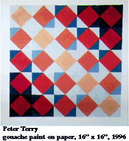
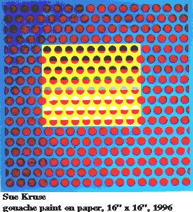
GOAL: Create a composition in gouache by repeating and then interrupting a symmetry group. You will be working to achieve spatial relationships in your design. When you dissolve, break or change a symmetry group, you establish movement away from and toward the *picture plane. Since uninterrupted repeating pattern accentuates flatness, disruption creates depth. You will also apply color gradation and color interaction to create space, volume and movement. This assignment is modeled on Vasarely's paintings. Don't hesitate to use short-cuts such as tracing paper and a Xerox machine, to reduce your labor on the project. PART 1, Layout: Observe from the attached examples where Vasarely creates movement, spatial and compositional relationships. The final format of the design must be 15" x 15".
Design a motif of approximately of 1.5 inches to use in any symmetry group from your previous
assignment. Simple geometric shapes will serve best for repeating and changing your motif
in this assignment. Choose one of the following methods to alter symmetry groups:
Note:
Suggested Method: *Picture plane: The actual flat surface on which the artist executes a pictorial image. The picture plane can also act as a transparent plane of reference to establish the illusion of forms (abstract or representational) existing in three- dimensional space. Final Painting: Decide what color scheme you would like to work with. Feel free to combine colors intuitively, or refer to the monochromatic, analogous, complementary, split complementary, and warm to cool systems. You will need to mix a minimum of three basic colors for the grounds and the gradations: two for the ground and one for the figure. It's possible to mix all of the other colors from these. If you have a sharp or highly contrasting line between colors in this background it will compete with the design of your pattern. It is helpful to soften the dividing edges when painting the background. See painting instructions for color grounds on the next page.
Plan ahead so that you can integrate the shift in background colors with the foreground. Your largest task will be to integrate both the color changes and the pattern changes to create a cohesive composition. By interrupting the pattern you will be creating a one unit composition instead of a design that infinitely covers the plane.
COLORED BACKGROUND
Testing colors
Shibori - A DefinitionShibori is used as an English word throughout this book because there is no English equivalent. In fact, most languages have no term that encompasses all the various shibori techniques, nor is there English terminology for individual methods, which often have been incorrectly lumped together as "tie-and-dye." Three terms for separate shibori methods have come into international usage: plangi, a Malay-lndonesian word for the process of gathering and binding cloth; bandy an Indian term for the same Process; and tritik, a Malay-lndonesian word for stitch-resist. However, these three terms represent only two ofthe major shibori techniques. In this context, the word shibori seems the most useful term for the entire group of shaped resist textiles. It is the hope of the authors that "shibori" will win acceptance in the international textile vocabulary. The special characteristic of shibori resist is a soft- or blurry-edged pattern. The effect is quite different from the sharp-edged resist obtained with stencil, paste, and wax. With shibori the dyer works in concert with the materials, not in an effort to overcome their limitations but to allow them full expression. And, an element of the unexpected is always present. All the variables attendant on shaping the cloth and all the influences that control the events in the dye vat or pot conspire to remove some of the shibori process from human control. An analogy is that of a potter firing a wood-burning kiln. All the technical conditions have been met, but what happens in the kiln may be a miracle or a disaster. Chance and accident also give life to the shibori process, and this is its special magic and strongest appeal. |
|
| < - Previous |Next - > | |  |