Lesson 1
Ritual Geometry
Mandala
Lesson 2
Group Elements
Color Theory
Lesson 3
Groups and Groups Acting on Sets
Block printing
Lesson 4
Klimt and the Computer
Color and symmetry in modern art I
Lesson 5
Islam
Islamic art
Lesson 6
Penrose and Rice
Color and symmetry in modern art II
Lesson 7
Escher 1
Escher 2
Lesson 8
Hundertwasser & Griffeath
Pattern and Modern Painting
Brian P. Hoke:
Cellular Automata and Art
Student's Work

|
|
Opening questions on examples of student mandalas


More Student Mandalas
What do you see in these Mandalas?
What kind of marks, lines, shapes?
What kind of media was used to create them?
How does the media affect the design?
Which designs are symmetrical?
How can we define symmetry?
Symmetry often functions as a paradigm of the balance and harmony found in the
natural world and great works of art. But mathematicians define symmetry in a more
specific way. They describe the repetition of forms as movement in space, and
distill symmetry and pattern into a set of laws that operate on an abstract
level.
From Hargittai: "SYMMETRY A Unifying Concept", p.47
Shelter Publications, Inc., Bolinas, California, 1994
A 2-dimensional motif can repeat in only four different ways.
These four types of repetition or symmetry operations are:
- 1) Rotation - the motif turns
From István and Magdolna Hargittai: "SYMMETRY
A Unifying Concept"
Shelter publications, Inc.
Folk Art, p.49
Decorations displaying exclusively rotational symmetry often occur
in folk arts. Old Native American pottery has decorations with a wealth of rotational-only
symmetry.
- 2) Reflection - the motif reflects, as in a mirror
From Hargittai: "SYMMETRY A Unifying Concept",p.2
From Hargittai: "SYMMETRY A Unifying Concept", p.73
- 3) Glide reflection - the motif translates and reflects,
From Hargittai: "SYMMETRY A Unifying Concept",p.135
- 4) Translation - one motif moves up or down,
left or right or diagonally while keeping the same orientation,
From Hargittai: "SYMMETRY A Unifying Concept",p.183
How does symmetry relate to pattern?
Artists use patterns more intuitively and expressively. Today we will be looking
at important elements of design: line, shape and
value. We'll also observe that these
elements of design can form patterns, and the effects these patterns produce on the viewer.
Design Elements
Line
Lines can exhibit many different traits. Lines can be straight, curved, zigzag
(angular), or broken.
This drawing by Steinberg shows a regular repetition of straight lines.
What sort of experience or mood do these repeating line patterns convey?
Saul Steinberg: "THE DISCOVERY OF AMERICA", p. 9
Alfred A. Knopf Inc., New York, 1992
The curvilinear lines in this drawing by Matisse incorporate many qualities: sensuality
elegance, economy, sensuality, and elegance.
From Bert Dodson: "Key to Drawing", p.47
Published by North Light, 1985
Van Gogh uses circular, energetic, emotionally charged lines.
From Bert Dodson: "Key to Drawing", p.49
Vincent van Gogh, Cypresses, Saint-Remy. 1889
The smooth undulating lines of this Japanese woodcut create an atmosphere that is
natural, harmonious and decorative. The density of line builds depth into
the compositon
Andrew W. Tuer: "Japanese stencil Designs", p. 40
Dover Publications, Inc., New York, 1967
In this sketch of sleeping figures Rembrandt builds up loose marks portraying
the presence of light and shadow with a "free and supple hand."
From Bert Dodson: "Key to Drawing", p.45
Rembrandt van Rijn, Saskia Asleep.

Using a pen or pencil, draw lines with different qualities
(angular, curved, etc) in your notebook.
Shapes
Shapes are visually perceived areas of value, color or line and any combination
of angular and curvilinear configurations. There are endless types of shapes:
soft; hard; round, etc. These traits allow artists to express different feelings,
ideas, personalities, i.e. shy, angry, loving. Geometric (angular) shapes are
machine like, dynamic, rigid. Biomorphic (curved) shapes suggest the possibility
of life, emotions, nature. Shapes can also help to create balance and consistency
in a composition. (Footnote1: Ocvirk, Otto G.:"Art Fundamentals") 2
- Angular shapes:
N. Simakoff: "Islamic Designs in color", p. 43
Dover Publications, Inc., New York, 1993
From Norbert Lynton: "The Story of Modern Art",
Cornell University Press, Ithaca, New York, 1980
Figure 146. Chales Sheeler: Church Street El.
- Soft open shapes:
Figure 54. Robert Delaunay: Window on the City
Figure 71. Vassily Kandinsky: Improvisation 13.
- Biomorpic shapes:
From Norbert Lynton: "The Story of Modern Art",
Figure 197. Jean Arp: Amphora
- Shapes combine to create patterns:
John Elderfield: "The cut-outs of Hehri Matisse"
CROWN TRADE PAPERBACKS- NEW YORK, 1987
Portrait of Fritza Riedler, 1906, p.56
Gustav Klimt
CROWN TRADE PAPERBACKS- NEW YORK, 1987
Portrait of Fritza Riedler, 1906, p.55
How does Klimt use shape?
Would you describe the shape combinations of Klimt and Matisse as patterns?
Negative and Positive Shapes
The dynamic of positive and negative space is the primary organization of space.
Areas that represent the artist's initial choice of shapes are called positive
areas. They can be recognizable or not. The empty spaces are called negative
spaces, but are just as important. (Footnote2: Ocvirk, Otto G.:"Art Fundamentals")
John Elderfield: "The cut-outs of Hehri Matisse"
CROWN TRADE PAPERBACKS- NEW YORK, 1987
Portrait of Fritza Riedler, 1906, p.51
- Are Matisse's shapes geometric or biomorphic?
- How do you respond to this composition?
Value
Value is the name given areas that are white to black or dark to light. The value
of an area is seen by the amount of light reflected from it. Value has expressive
power. (Footnote3: Ocvirk, Otto G.:"Art Fundamentals")
The World of M. C. Escher,
Figure 109. Three Spheres II. p. 94
Light hitting a solid creates shadow and a sense of volume. Variations in light
and dark create planar space. Value gradations evoke gradual movements across a
plane or around a sphere. Even,flowing tones create a gentle curve, while abrupt
changes in value produce sharp or abrupt angles in space.

Observing an unfocused slide of a black and white photograph to
draw and explore the values of its composition: With your pen, draw a small
rectangle (about 4"x6") in your notebook. Depict in your own way the pattern of
dark and light values you see within the rectangle.
After the exercise, the slide is focused so that image is clear.
What was it like for you to make an abstract composition?
All compositions have an abstract foundation of lines, values, and shapes.
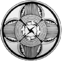
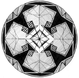
Mandalas
For Homework students design two Mandalas
A Mandala is sansckrit for circle - slide
Mathematically a circle is defined to be the set of all points in a plane
equidistant from a given point called the center of the circle. Geometriclally
the circle is divided into units called degrees. A circle has an infinite amount
of symmetries. How are the designs in the mandala format different from a
rectilinear composition?
A line web of ideas expands outward from a center -- computer graphics.
Mandalas are found everywhere and have powerful symbolism across all
cultures
All circles have a center. This is principle of the center. The center is
everywhere.
The center represents expansion and integration of opposites, micro and macrocosms.
The center also represents the soul, god or the individual.
Circles symbolize unity/time/universal cycles/life creation/eternity/god/sun.
Circles/mandalas contain all symmetries.
All of Nature's harmonious principles
are exhibited through it's harmonious relationships.
From Jose and Miriam Arguelles: "Mandala"
Shambala: Berkeley and London, 1972
Mandala of Kalachakra, p.14

Two mandala designs due in one week.
Parts a and b to be started and completed in class1 if possible, and turned in
with homework at critique.
Materials
a and b: pencil, ruler, brushes, black and white paint, white paper. For c and d
add, black construction paper, a compass and black marker
Part a: Gray Scale
The purpose of this exercise is to develop skill in seeing and using the
gradations of value that range between black and white. This will provide
background for color studies, since many colors combine hue with. black and/or
white. Neutral areas of light and dark are sufficient within themselves to create
powerful visual statements, as evidenced by many black and white photographs,
prints, drawings, paintings and fabrics.
On a small sheet of drawing paper, draw a vertical or horizontal bar of 9 one
inch squares with a pencil and ruler. Observe the range of grays in your
photograph. Try to find at least 9 shades of gray, mixing paint to match.
Fill in the squares with thee gradations in a light to dark arrangement. Mix your
paint with water to about the consistency of slightly melted ice cream.
Part b: Irregular geometric design.
Students work from black and white photographs.
The purpose of Part b is to translate recognizable images into abstract shapes and
define them in relationship to each other with a subtle range of values.
- 1. On a piece of white paper outline a 12" square or rectangle.
- 2. Sketch an abstract design of irregular geometric shapes based on observation
of your photograph.
- 3. You may follow the relative composition of the photograph.
- 4. Paint the design using your knowledge of grays from the previous exercise.
Be as sensitive to the negatinve shapes as you are to the positive shapes.
Observe how scale (size and value can create spatial relationships).
Part c: Extract a shape for mandala
In Part c you will extract a particular shape from your painting to use as the
main repeating motif in your mandala. A good method is to cut a small triangular
window in the center of a piece of paper and scan your design for a shape that
you like. Once you have isolated a motif, trace or draw it. Make several
templates by placing the shape on black construction paper, tracing around it
and cutting it out.
- 1) Draw a circle with a radius of 5 1/2 inches on white paper and lay out
your shapes. Your mandala can grow larger than this dimension. Play with
the shapes, moving them around to see what kind of negative areas they make in
different locations and directions. If it's not right, modify the shape until
you like it by cutting or redesigning it and making new templates. Use two
different sizes of the final shape and arrange your mandala.
- 2) When you have decided on the design, trace around each shape with a pencil.
Notice the kind of momentum the circle creates and how you can work with it or
counter it. Include the center as an important part of the design even if it
is blank. Maintain symmetry in the center. This mandala must have at least
3 fold symmetry.
- 3) Decide which areas you want to be negative or positive. Start outlining
and filling in with black marker.
- 4) Use negative areas for freehand embellishment, creating repetitions and
rhythms with points, lines or other small shapes. Be conscious of the density
and intervals of the repetition in relation to the rest of your mandala design.
Repetition is regular repeat ing . . . . . .
A rhythm is repetition organized in intervals .o.. .o .o.. .o
Part d:
Create a second mandala by reinterpreting your first black and white design
with at least four different values. These grays can be mixed in a gradient
ranges of high key (lighter) or low key (darker) grays. Alter the new
design as much as you want to make it successful. You can keep the two designs
visually related or depart widely from the first mandala. Suggestion: explore
using different values to create overlapping shapes.
From Wucius Wong: "Principles of Color Design",
Published by VAN NOSTRAND REINHOLD p.32, Figure 87, 88
M. C. Escher:"ESCHER on ESCHER Exploring the Infinite"
Circle limit IV, p. 42
Jose and Miriam Arguelles: "MANDALA",
SHAMBALA PUBLICATIONS INC., p.38
From Ocvirk, Otto G. : "Art Fundamentals"
Design Elements


USING GOUACHE
Gouache is a water based opaque paint mixed With a gum base. When storing mixed
colors, add a drop of water to the top
YOU NEED
Jars for water
Small containers with lids for storing mixed colors or a palette
Containers for water
Paper towels
Brushes
MIXING
Open the tube of paint and get rid of any clear liquid on the top. This is an
oil and it will streak.
Mix your colors on a pallet, or if you are mixing a larger amount use a container
with a lid. Use a cheap brush for mixing. For your first assignment d palette is
fine. Always add some water to your paints, but use water sparingly. The consistency
of the paint should be like thick melted ice cream.
Dark colors require a lot of white to get to a light color, so start mixing from
lighter to dark. Begin by adding a small amount of black paint on you palette to
a larger amount of White paint.
THE GRAY SCALE:
For each darker gray continue adding small amounts of black into the Whites moving
toward the a near black range at the end. Note that's some areas will appear to
look the same even though more black was added to the mixture. This is because at
a certain point the amount added to the mixture must increase in order to effect
a visual change.
Use a small brush to paint the edge of shapes. Paint away from the edge uncorking
from one side of the shape to the other.
SUPPLIES TO BRING FOR NEXT ART CLASS
Pencil/ eraser
hammer
tracing paper
measuring tools
graph paper
Plexiglas
black marker
block cutting tools
white paper
ink roller
safety kut block
Speedball printing inks
mat board scraps for mixing ink
x-acto blade or mat knife
You may get printing ink on your clothing, so bring or wear something you can print in.
Instead of working out initial ideas on the White paper in your kit, you could
purchase a pad of newsprint. You can also use your graph paper for this but the
newsprint is better for block printing tests.
|
