Lesson 1
Ritual Geometry
Mandala
Lesson 2
Group Elements
Color Theory
Lesson 3
Groups and Groups Acting on Sets
Block printing
Lesson 4
Klimt and the Computer
Color and symmetry in modern art I
Lesson 5
Islam
Islamic art
Lesson 6
Penrose and Rice
Color and symmetry in modern art II
Lesson 7
Escher 1
Escher 2
Lesson 8
Hundertwasser & Griffeath
Pattern and Modern Painting
Brian P. Hoke:
Cellular Automata and Art
Student's Work

|
|
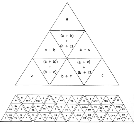
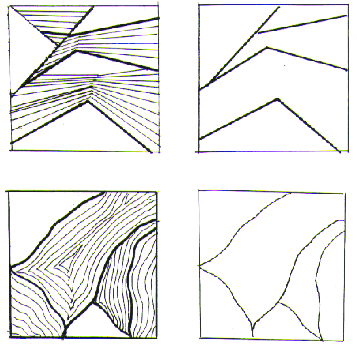
Bring finished triangles to critique
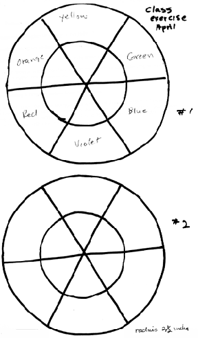
color wheels: mixing, secondary colors from primaries
1. Squeeze out yellow, red, ultramarine, turquoise and magenta onto your palette.
Mix two color wheels with secondary colors from each of the following sets
of primaries:
yellow, red, ultramarine
yellow, magenta, turquoise.
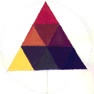
2. Using a ruler, copy the large triangle onto a sheet of drawing paper.
Choose a formula from any of the small triangles on the bottom of your handout.
Mix colors according to the chosen formula and paint your triangle.
When completed, paint two more triangles with new formulas.
Triangles: mixing a range of colors from three hues
- 1) "Color begins with and is derived from Light.
Where there is a little light, there is little color
. . . where there is strong light, there will be strong color."
(From: "Art Fundamentals")
- 2) Rays of light from the sun are composed of waves vibrating at different speeds.
- 3) The sensation of color is aroused in the human mind by the way our sense
of vision responds to these different wavelengths.
- 4) Spectrum
A beam of light passes through a prism and reflects from a sheet of white paper.
The light rays are bent or refracted as they pass through. Our sense of vision
interprets these as individual stripes in a narrow band called a spectrum: red
orange, yellow, green, blue, indigo, violet. They are pure. These are the
hues which are the most intense form of color. Our eyes divide about 150 hues.
- 5) Subtractive and Additive color
When white light hits the surface of an object the surface will, according to
the particular molecular structure, absorb some wavelengths of light and reflect
others. The color of this reflected light is what we see. If all of the light
is absorbed, it will be black or white to an equal degree. If all the white
light in the spectrum is reflected, the surface will be white. Mixing with
reflecting light (as in theater lighting) is called additive color. Mixing
with light that is absorbed (as with pigment) is called subtractive color.
Unless we are working with light itself as a medium, our medium is not color,
it has color. Pigments/paint have color or absorb wavelengths of color.
In this class we'll be working with pigments and subtractive color mixing.
In subtractive color when all the colors are mixed, we obtain a neutral or black.
Black is the absence of color. It absorbs all light equally.
Subtractive color theory: a way of organizing color and mixing pigments:
Hue, Value, Intensity
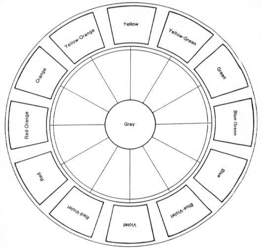
Hue
In order to visualize relationships clearly, we arrange the hues in a circular
a design. We can mix around or across the color wheel.
From Benjamin Martinez and Jacqueline Block: "Visual Forces
An Introduction to Design"
PRENTICE HALL, 1988
p. 186, Figure A
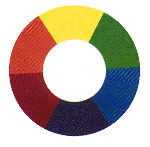
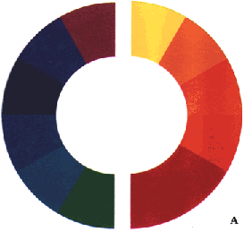
Primaries
Primaries are the three principle hues. They have specific positions on the
color wheel. Red, yellow and blue are the primary triad. They are spaced equally
apart on the color wheel with yellow at the top, and red on the left and blue
on the right in this example. The primaries are said to produce all of the colors.
But in reality, along with the primaries red, blue and yellow, we also need
turquoise and magenta to mix a wide range of colors. Theoretically, the primaries,
themselves, cannot be mixed from any other colors.
The three primaries neutralize each other when mixed together.
Mixing any two primaries produces a neighboring secondary color
Secondary colors
On the color wheel secondary colors are placed between the two primaries from
which they are mixed. Orange between red and yellow, green between yellow and
blue, and purple between red and blue.
Intermediate or tertiary colors come between each primary and secondary:
orange red, blue green, etc.
Analogous colors
Analogous colors are adjacent to each other on the color wheel. A group of
analogous colors contain at most two primaries. Analogous colors have a very
harmonious influence on a work of art.
Complementary colors
Complementary colors are opposite each other on the color wheel. Blue/Orange,
Yellow/Purple, Red/Green. When mixed together they produce neutrals. Placed
beside each other in a composition, they create contrast, and often, vibration.
From Benjamin Martinez and Jacqueline Block:
"Visual Forces
An Introduction to Design"
PRENTICE HALL, 1988
p. 195, Figure C
Value
From Benjamin Martinez and Jacqueline Block: "Visual Forces
An Introduction to Design"
PRENTICE HALL, 1988
p. 188, Figure A, B
There are a wide range of color tones that can be achieved by modifying one hue
with the addition of neutrals, black and/or white. The property of value
distinguishes between the lightness and darkness of a hue. We can mix a hue
with black, white, gray (neutral), or with a darker or lighter hue.
All colors reflect a different quantity of light as well as a different wavelength.
Each hue has a normal value that indicates the amount of light it reflects.
It can be made lighter or darker than normal by the addition of white and /or black.
It is important to recognize the normal value of a hue.
Intensity
From Benjamin Martinez and Jacqueline Block: "Visual Forces
An Introduction to Design"
PRENTICE HALL, 1988
p. 190, Figure A B C
Value is the quantity of light of a color, while intensity is the quality of light
of a color. We also refer to intensity as the degree of saturation in a color.
Spectrum hues have the highest intensity.
There are four ways to change the intensity of a color:
1. Add white. This will make the value higher (lighter) and change the intensity.
2. Add black. This will make the value lower (darker) and change the intensity.
3. Add gray. If the gray is the same value as the original hue, the intensity
will change, but not the value.
4. Add complementary hue.
The mixture of two hues exactly opposite each other on the color wheel such as
red green, blue orange, or yellow and violet result in neutral gray or brown.
Complementaries present an equal balance of three primaries, a different result
than adding neutrals.
From Benjamin Martinez and Jacqueline Block:
"Visual Forces
An Introduction to Design"
PRENTICE HALL, 1988
p. 191, Figure D
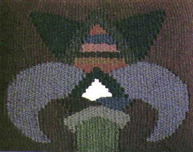
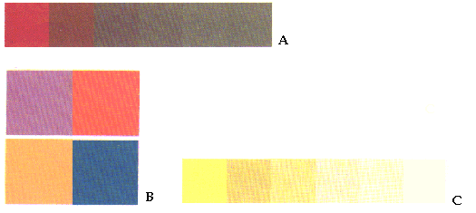
Geraldine Millham, Chairback Tapestry (detail). 1984.
p. 191, Figure E
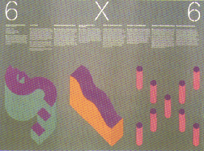
Michael Vanderbyl, "Six by Six." (Vanderbyl Design, San Francisco)
In these examples we can see how one color beside another changes the character
of other colors. In the first image closely related, low intensity colors are
used to create a soothing atmosphere. In the second image, high intensity
shapes create a contrast against a soft background with low saturation of color.
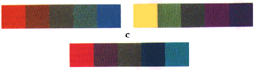
Color relationships
Closely related colors
Complement colors or extreme value contrast
Split complement = a color and two color on either side of its complement
blue/orange red/orange yellow
Transparency affects the intensity of a color
Warm/Cool
Warm colors are said to be on the red/yellow side of the color wheel.
Cool colors are on the blue/green side of the color wheel.
From Benjamin Martinez and Jacqueline Block:
"Visual Forces An Introduction to Design"
PRENTICE HALL, 1988
p. 192, FIGURE A
From Benjamin Martinez and Jacqueline Block:
"Visual Forces An Introduction to Design"
PRENTICE HALL, 1988
p. 219, Figure B
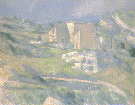
Paul Cezanne, "Houses in Provence." c.1880.
(National Gallery of Art, Washington; Collection of Mr. and Mrs. Paul Mellon)
From Benjamin Martinez and Jacqueline Block:
"Visual Forces
An Introduction to Design"
PRENTICE HALL, 1988
p. 219, Figure C.
Howard Hodgkin, "Goodbye to the Bay of Naples." 1980-1982.
(Private Collection)
Blues tend to recede into the picture plane, while warmer hues come forward.
These effects are dependent upon each individual work of art. In the painting
below by Cezanne, the warms come forward and the cool colors recede. However,
in the abstract painting by Howard Hodgkins, the sharp blue shape in the center
of the composition moves forward because of the scale and power of that color.
(#1 Martinez)
 (Color part) (Color part)
These color exercises will give you experience in:
- 1. Mixing the value changes of a color by adding black and white.
- 2. Recognizing the value of a pure hue by matching it to a gray scale.
- 3. Lowering the intensity of two complementary colors by mixing them
together in gradually increasing degrees.
- 4. Designing with color gradations which are step by step shifts in color
from dark to light, warm to cool, green to red, yellow to orange, etc.
- 5. Perceptual mixing and painting
The first 3 assignments can be grouped together or arranged on small, separate
pieces of paper. You will need to put the first two, Value Change and Normal
value of Pure Hues, on one sheet of paper, or make separate, identical, gray
scales for each one. Make a simple but attractive presentation.
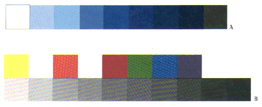
- 1. VALUE CHANGE:
Paint a gray scale bar with nine segments, 1.5 inches by 9 inches as in the
middle vertical column of sample a. You may, if you prefer, cut and paste
from your original 9 bar gray scale. In the left column place any hue from the
color wheel matching it to its nearest corresponding value in the gray scale.
Mix white with this color to match the lighter values, and black to match the
darker values.
sample a
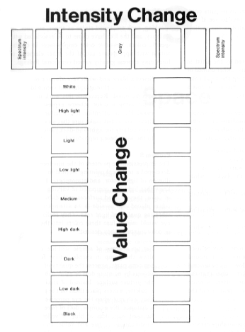
- 2. NORMAL VALUE OF PURE HUES
Remember that pure hues have there own "normal" value. This is most obvious
when the colors of the wheel are placed in relationship to a scale of neutral
values from black to white. Yellow is the highest, because a large amount of
light is reflected, and blue-violet is the lowest, because a small amount of
light is reflected.
Choose and mix 9 pure hues from the color wheel. There are 12 altogether:
See sample b.
In the right column, match these colors to the values of your gray scale. This
might not be a vertical progression. Leave room to put two hues beside each
other rather than below if they both seem to have the same value. This exercise
is meant to develop your eye, not to prove you right or wrong. Note: without
turquoise you will mix darker, often muddy purples.
- 3. INTENSITY CHANGE
Use any pair of complementary colors to create the intensity scale. See the
horizontal bar in sample a. Make your scale 1.5 inches by 9 inches. At either
end the colors should be at spectrum intensity. Gradually, mix a little of
the complement with each color until a neutral gray is produced, which is placed
in the middle rectangle.
- 4. GRADATION DESIGN
Make 6" by 6" to 8" by 8" square on a piece of white paper. With a light pencil
create a simple abstract composition by making 3 or 4 lines across the page,
or invent your own shapes.
See sample c. Segments can have different widths.
There can be solid areas in the compositions.
You will be breaking these large shapes down into areas of gradated colors. For
each shape there should be at least nine gradations. Your design should cover
the whole page, and there should be no paper showing. Use white paint for white
areas. Choose one color scheme for the whole design based on a gradation from
any of the following: monochromatic value change (a hue mixed with various amounts
of black and white); analogous (gradations between two analogous primary colors);
intensity (gradations between two complementary hues or two split complementary hues).
Part 3 and 4 can be combined into one exercise by using complementary colors to
create the gradations in part 4.
- 5. PAINTING: AND MIXING COLORS FROM PERCEPTION
Create a 6 inch by 6 inch grid on a piece of white paper. The squares will be one
inch.
See Sample d.
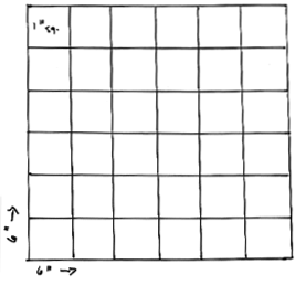
Choose a fruit or vegetable, with colors that you would love to paint. If
possible paint during daylight and place your vegetable in a place where the
light will illuminate part of its surface. Artificial light is fine too. You
will still need an underlying structure of shapes for your painting. Draw a
simple shape in light pencil representing the still life. Be sensitive to the
way you place the subject within the square. The negative shapes you create
between the figure and the edges of your paper are critical to your composition.
Squeeze out a sample of each color onto the palette. Observe the subtle color
shifts and the contrasts reflecting off the surface of your subject. Begin to
mix colors by looking at the subject and locating them approximately on the grid.
Include colors from the shadows and light of the background to inspire your
mixing as well. Each spot represented by a square on the grid will have a
variation of color. Use your knowledge from the previous color exercises to
help you mix. Is it pure hue? How much black, complementary color or white is
needed to arrive at a pale, subtle color, or a rich, dark color? How do the
colors interact? Does a bright color suddenly look dull beside a new color square?
You may vary thick and thin paint with water. Gouache has transparent watercolor
properties as well as an opaque look, and its different densities convey a
variety of light and color. Be interpretive in your color mixing, but continue
to use perception as the inspiration of your color choices. Even the realism
of photography organizes the color of a subject within its own system. Fill
in each square completely. It's okay to lose the precise image of the subject
to a grid that conveys the just the movement of color.


Materials for next week
bring ink and paper
transfer paper
plexiglas plate
newsprint
pencils/eraser
measuring tools
carving tools
safety kut
printing ink
roller
|