|
|
Lesson 3:
|
|
Lesson 1 Ritual Geometry Mandala Lesson 2 Group Elements Color Theory Lesson 3 Groups and Groups Acting on Sets Block printing Lesson 4 Klimt and the Computer Color and symmetry in modern art I Lesson 5 Islam Islamic art Lesson 6 Penrose and Rice Color and symmetry in modern art II Lesson 7 Escher 1 Escher 2 Lesson 8 Hundertwasser & Griffeath Pattern and Modern Painting Brian P. Hoke: Cellular Automata and Art Student's Work

|
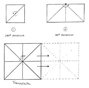
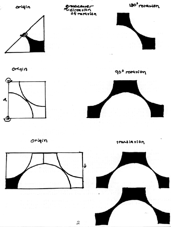
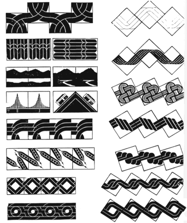
REVIEW OF SYMMETRY OPERATIONSA 2-dimensional motif can repeat in only four different ways. These four types of repetition or symmetry operations are:
1) Translation - one motif moves up or down, left or right or diagonally while keeping the same orientation.ROTATION If you rotate one fundamental region around a point you can superimpose it exactly on another fundamental region. The center of rotation is called a roto-center. Distant centers of rotation produce apparent translations. Roto-centers can be in the center of a unit cell line. REFLECTION The image reverses as in a mirror. Mirror lines divide areas of reflection. With translation or rotation, the image at the start can be directiy superimposed on the image at the finish, or anywhere along the way. Reflection lacks this continuity. The motif does not stay on the surface of the plane, it flips over. Because it flips rather than glides, it is called an indirect or improper operation. Rotation and translation which involve displacement are called direct or proper operations. GLIDE REFLECTION Glide reflection is an indirect operation. The image reverses, but in addition it glides. Instead of a mirror line, we have a glide line, or, a line that marks the path of a translation. Glide lines can run vertically, horizontally, or diagonally. Mirror reflection is a special case of glide reflection. Mirror reflection is glide reflection with zero glide, as translation is a special case of rotation. Thus, the four symmetry operations are reduced to two operations--rotation and glide reflection. A symmetrical figure has repetative parts. The letters A B C are symmetrical through reflection. A mirror through the center leaves their appearance unaltered. A figure is symmetrical if a symmetry operation leaves the appearance unaltered. N and Z are symmetrical by rotation. The word " bud " is symmetrical by mirror reflection. The word " pod " is symmetrical by rotation. The word " bobo " is symmetrical by translation.
GLIDE REFLECTION
A Succession of glide reflections establishes the akternate pattern of branching and leaf arrangements in this natural form. PRINTING DEMONSTRATION
 (Black/White part) (Black/White part)
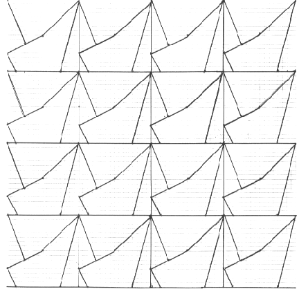
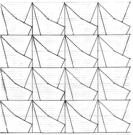
You will need a sheet of 8 1/2 by 11 transfer paper and two sheets of light weight Rives printing paper in addition to your other supplies. STEP 1: Draw a 3 inch square on graph paper. Within the square make a simple asymmetric design of 5 to 8 pieces, with straight lines, curves or both. Make sure your design is asymmetric. Blocks that mirror symmetrically along a diagonal line are ones for which the symmetry is most often missed Check carefully for this. If you have trouble designing, you can hold a ruler high in the air, then drop it on the square. Draw a line where it lands. Repeat this process several times. Blocks with a solid bar down an outside edge tend to produce less exciting designs. If you have a bar, on the edge of your design, break it up or eliminate it. If you have lines drawn at odd angles, arrange them to begin and end on intersections of your graph paper. It will be easier to re-draw them in the next step of the process. When your block is drawn you need to make a number of copies of it, all identical. Sixteen is a good minimum number to work with. For three inch blocks you will need more than one sheet of graph paper. You will also be making an identical number of mirror images. Two methods for making reflections: 1 ) "You will be drawing 3" square blocks on the top sheet of the graph paper. Before you start to draw, lift up the top sheet and the second sheet of your pad and insert a piece of transfer paper, carbon side up, under the second sheet. As you draw on the top sheet, mirror blocks will come out on the back of the second sheet." Bear down hard. Mark A on the top of each block and B on the right side of each block before you rip the sheets off the pad. Cut the blocks apart. See sample "a". (This sample was done with 2 " blocks and then reduced for the copy). You will need more than one sheet of graph paper to do 3" blocks. In other words, you will use more graph paper designing the three inch block suggested first, but it will match the size of your printing block which must also be a 3" square. 2) Drawl 6 blocks edge to edge on one sheet. Mark the sides A and B. Have an acetate (clear plastic sheet) made on a copy machine. Have two copies made, on cardstock if possible, with the acetate first one surface up, then the other surface up. Use these blocks to experiment with rotation, reflection, translation and glide reflection. Thursday's exercise is one such pattern of rotation and reflection. STEP 2: After experimenting with paper blocks and symmetry operations, choose a pattern that intrigues you. Transfer the design to a 3 inch block and carve it out. Remember to draw the design on the back of your block to avoid printing errors. STEP 3: Experiment. Mix up a color and do test prints on white paper or newsprint to see how your pattern works in printing ink. PLAY. Try overlapping. You can cut small stamps out of the printing material to add extra shapes and colors for accent. Experiment with a few colors, and try using more than one color on your block. You can also make small patches with gouache to test out color combinations. STEP 4: Make 2 final prints. See below
sample "b"
sample "c"
To turn in for homework: 1. On a sheet of heavy weight Rives paper: print your block pattern in two analogous colors. Each design from your block should have a minimum of 16 impressions. Four impressions across and four impressions down. Make sure to register your printing carefully to the edges of the paper so that your pattern is squared and centered neatly on the paper. 2. On a sheet of Rives paper: using the same block make a new pattern with the same number of impressions. Create the second pattern so that it looks completely different from the first pattern. Use two split complementary colors. How many different ways can you alter this pattern mathematically using the same block? Can you change the negative spaces. What happens when you change and shift the color with colors and values? 3. Glue the paper square pattern to another sheet of paper and bring it in for the crit Remember that the paper is an off white. It represents a third color in its own right and will be the color of your negative shapes. Integrate all colors into the design to work with the symmetry of the pattern and please your aesthetic sense as well. You can simply alternate one color after the other in the printing process or choose a more complex sequence for the color. Optional: use a stamp to add more colors and shapes to the design. If you choose a pattern with reflections, you must carve a separate block to print the reflection of the original.
From Robert Henri: "THE ART SPIRIT"p.56
p. 168
From Ocvirk, Otto G. :"Art Fundamentals"
|
|
| < - Previous |Next - > | |  |