Description and Requirements
The Book
Bibliography
Syllabus
 Introduction
 The Great Pyramid
 Music of the Spheres
  Number Symbolism
  Polygons and Tilings
  The Platonic Solids
  Roman Architecture
  Number Symbolism in the Middle Ages
  The Wheel of Fortune
  Celestial Themes in Art
  Origins of Perspective
  What Shape Frame?
 Piero della Francesca
  Leonardo
  Façade measurement by Trigonometry
  Early Twentieth Century Art
  Dynamic symmetry & The Spiral
  The Geometric Art of M.C. Escher
  Later Twentieth Century Geometry Art
  Art and the Computer
  Chaos & Fractals
 WHAT SHAPE FRAME?

Slide 13-52: Claude Lorrain, A Rest on the Flight into Egypt @
We've looked at the plane figures; polygons like the square, rectangle, and hexagon, as well as the circle. We've examined their geometry and shown some of their uses in sacred geometry and in art and architecture. In this unit we'll explore these figures as shapes of frames; how and why a particular shape was used and how it affects the enclosed picture or sculpture.
We'll briefly track the development of paintings from no frame, to open frames, complex frames, and multiple frames, and the altarpiece. We'll show four reasons for having a closed frame, and see how some artists have used axes of symmetry, zones, diagonals, and microthemes.
We'll explore several rectangular formats, the square, double square, overlapping square, and the golden rectangle, and the round format, in painting, sculpture, and medallions, and finish with the elliptical format.
| Outline: | Why Frame a Picture? |
| The Quadro or Rectangular Format | |
| The Square Format | |
| The Tondo or Round Format | |
| The Roundel | |
| Ovato Tondo and the Elliptical Format | |
| Summary |
Why Frame a Picture?
In our last unit on perspective we saw that one function of the frame was as a window frame through which we viewed the world. Other purposes for the frame are:
1. To separate inside from outside; to state that a picture is a world of its own, and not a part of the surrounding world.
2. To provide visual control. This separation from the outside world makes it possible for the painter to control the composition. The meaning of things we see depend partly on their surroundings, so if the surroundings can't be controlled, the meanings cannot be controlled either.
3. For portability
No Frame: Prehistoric Wall Paintings.

Slide 13-1: Cave Painting of a Bison, Altamira, Spain c. 15,000-10,000 B.C.E., Hartt p. 38
Of course, not all pictures were framed. Cave paintings are an example of unframed pictures which generally focus on a single figure or animal, without much regard to the surrounding figures.
Partial Frame: The Frieze

Slide 13-2: Darius and Xerxes Giving Audience, Persian, c. 490 BCE. Janson p. 95
An example of what might be called a partial frame is the frieze, often found in the temples. It is closed at top and bottom and open at the ends.
Tapestries and Scrolls

Slide 13-6: The Battle of Hastings, detail of the Bayeux Tapestry. c. 1073-83. Janson p. 325
Other open frames include Oriental scrolls or tapestries, like the famous Bayeux Tapestry, depicting the Battle of Hastings.
Closed Frames: Murals and Frescos

Slide 13-8: GIOTTO, Scrovegni Chapel Frescos. Electra p. 11
Murals and frescos might be open, like the Oreszco Frescos, or have clearly defined outlines like in the Scrovegni Chapel.
Time Frames
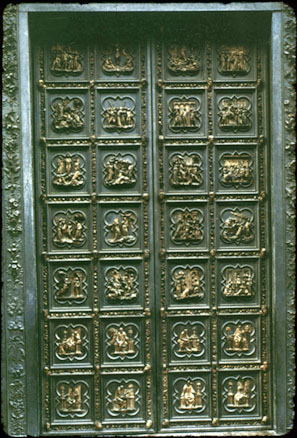
Slide 13-9: GHIBERTI, Baptistery North Doors, 1403-24, Scenes from the New Testment
A frieze, mural, or fresco might sometimes have a time progression as well as a spatial one, a property that relates them to music. The individual pictures are like the frames in a movie film or pages in a book.
Frames have taken all sorts of elaborate shapes; lancets, Gothic Arches, and quatrefoils as in the Baptistry North doors shown here.
The Altarpiece

Slide 13-11: FRA ANGELICO, Deposition. C. 1440.
Perhaps the most elaborate frames of all were the Medieval and Renaissance altarpieces, with their mountain ranges of pointed peaks. They look pretty old to us now, but Jacob Burckhardt writes that the great tradition of modern European easel painting started with the Italian Renaissance altarpiece. The altarpiece was on the cutting edge of Italian painting, using the most advanced methods and materials.
There were no rules for the design of an altarpiece, so it was a place where artists could experiment with new methods and materials. Altarpieces show continual change over the years, both in shape and subject matter. They were regularly replaced by the latest model, the old altarpiece often cut up and pieces scattered in various galleries.
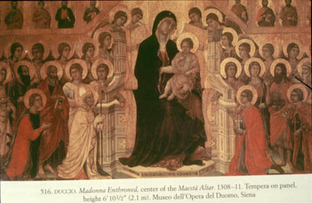
Slide 13-12: DUCCIO, Maesta Center panel, 1308-11. Siena. Janson p. 369
Duccio's super-altarpiece, the Maesta was a big deal in 1311. According to Hartt, it was carried from his studio to the cathedral in a triumphal procession, the people carrying lighted candles and torches, to the sound of all the bells of the city, and the music of trumpets and bagpipes. But Vasari writing in 1550 says he could not even locate the old altarpiece. But we can see most of it today in the Cathedral Gallery in Siena a few years ago.
There's also a piece of the Maesta in the National Gallery in Washington and another bit in the Frick Collection in New York.
Portability
Most of the pictures we've seen are fixed in place, painted on a wall or carved on a pediment. But during the Renaissance the growing desire of people to buy and own paintings and other art objects loosened the connection between an artwork and its location. According to Arnheim, paintings, religious and mythological subjects, landscapes, genre scenes, could be made in the studio for none in particular and sold and eventually resold. They were part of what we now call the art market. For this, pictures had to be portable, and we add portability to our list of reasons for framing a picture.
The Switch to Oils and Canvas
Portability may have been one reason to switch from paintings on wood panels to canvas.
Most of these altarpieces were painted with egg tempera on wood panels, standard for altarpieces until at least the 1520's. Canvas had been widely used in Venice for large-scale painting since the 1470's. It was cheaper than wood, and more portable. This made it better for the growing art market of the 1500's.
At about the same time period there was a shift from egg tempera to oils. To make paint, an artist had to grind pigment from minerals or plants into a powder, and add a liquid to make a paste. If egg was used we get egg tempera, which was used as early as the 12th Dynasty in Egypt, (about 2000 B.C.E.) and continued in use during through the Renaissance. It was fine, but dried quickly.
Jan Van Eyck, sometimes called the discoverer of oil painting, wanted a slower drying paint to produce the smoother transitions of colors that he wanted. So he substituted oil for egg, and got a slower drying mixture. It also allowed making of glazes.
The Quadro or Rectangular Format

Slide 13-17: A Sunday on Le Grande Jatte - 1884. 1884-6, George Seurat (1859-91)
We've seen what frames do. The next question is what shape to use? The shape of a frame is often called the format. We'll talk about the square format, and the round format. But first, the rectangular format
According to Fisher, as artists turned from painting on wood panel to canvas, the use of the rectangular format increased because it is easier to cut wood into interesting shapes than to construct frames in these shapes and stretch canvas over them.
Once we have decided to use a rectangle, we must decide on (1) orientation and (2) proportions of that rectangle.
Portrait or Landscape
By orientation, we simply mean whether the long side of the rectangle is vertical or horizontal. Of course, a landscape normally calls for a horizontal format; a portrait calls for a vertical format. Computers even use the terms portrait and landscape to distinguish between the vertical and horizontal formats.
The orientation may affect how the contents are seen. For example a standing figure painted in a portrait format appears taller and thinner; a standing figure painted in a landscape format is accentuated. It stands out more, because of the contrast with the horizontal frame.
What Shape Rectangle?
So once you decided whether to orient it portrait or landscape, what proportions do you make it?
Within the rectangular format, there's one format for movie films, another format for wide-screen movies, and for video, others for different kinds of photographic film, and still others for paper, like the 8.5 x 11 format.
Golden Rectangle

Slide 10-38: Botticelli, Birth of Venus
Why not use the golden rectangle for every painting, as it is often claimed to be the most esthetically pleasing. These claims seem to be based mostly on the work of Gustav Fechner in the 1860's, who presented people with rectangles of white cardboard on a dark table. In this test they tended to prefer proportions approaching the golden ratio (1.62 to 1). But, when measuring frames in a museum, Fechner found that the favorite ratios were:
for vertical pictures 5:4 or 1.25 to 1
for horizontal pictures about 4:3 or 1.33 to 1
In other words, artists used frames more compact than f, the vertical more so than the horizontal.
Why did artists prefer a squarer shape? My own opinion comes from the very title of Arnheim's book, The Power of the Center. As we move from the center things lose importance. Also, as we'll see, a squarer format is consistent with rest, repose, dignity, and timelessness; things that artists often want their paintings to convey.
Overlapping Squares

Slide 13-19: Saint Francis Before the Sultan. Giotto (1267-1336/7), Santa Croce. Fl.
So most rectangular pictures are made with no particular proportions, but there is one that appears often enough to mention; a rectangular painting made up of two overlapping squares.
In this painting by Giotto, the inner rectangle is formed by two overlapping squares with sides equal to the short side of the outer rectangle. Also, the crossings of the diagonals fix the base of the throne and the height of the partition in the background.
Axes and Zones

Slide 13-21: Botticelli's Annunciation c. 1492
A rectangle has two axes of symmetry, vertical and horizontal. An axis of symmetry is often used to divide a painting into distinct regions. Here the vertical splits scene into two regions, the natural region of the Virgin, and the supernatural region of the archangel Gabriel.
The Diagonal

Slide 13-22: TIEPOLO, Apollo Pursuing Daphne, 1755-60. Fisher p. 156.
Another compositional device is to use the main diagonal to make the picture more dynamic. The diagonal of a rectangle is not an axis of symmetry but it also is sometimes used to split the picture into zones, as in the Tiepolo, with the God on one side and the mortals on the other.
The Square Format

Slide 13-26: Donatello: Madonna of the Clouds c. 1427
The square is a special case of the rectangle, and artists have used some of the same devices, such as using the diagonal to separate a picture into two zones. But unlike the rectangle, the diagonal of a square is an axis of symmetry.
But the square format has one property that the rectangular does not; it gives a scene stillness and serenity, a calm and dignity which we'll see again in the round format. This makes it ideal for a subjects such as a Madonna
Raphael: Knight's Dream, or Dream of Scipio

Slide 13-27: The Knight's Dream Raphael, 1504-5, Old Janson, p. 124
We saw a Raphael before, his School of Athens of 1510-11. Here we look at two earlier works.
Here again we have a division into zones, but this time by the vertical axis. The vertical tree divides the picture into two zones; virtue and beauty.
This picture also shows what Arnheim calls a microtheme, a miniature version of the main theme acted out near the center of the picture, often with the hands. In the Knights Dream the microtheme is the choice between book and flowers, representing the larger choice shown in the painting, the choice between virtue and the pleasures of beauty.
Raphael: Deposition
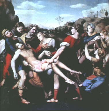
Slide 13-28: Deposition, Raphael, 1507
Arnheim says that what might be a dynamic scene here is made static by the square format. The microtheme is one support: the gentle raising of Christ's hand by Mary Magdalene, and the young man's strong grip on the cloth. This is an act of raising up, foreshadowing the ascension.
Munch: The Sick Girl

Slide 13-30: The Sick Girl. Edvard Munch, 1896
Here we have a strong diagonal separating the realm of the sick daughter from that of the grieving mother. The microtheme at the very center, where the mother reaches for the daughter's hand but can no longer touch it.
The Tondo or Round Format
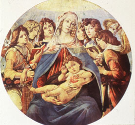
Slide 37: Madonna of the Pomegranate, Sandro Botticelli, 1487. Arnheim p. 77.
A round painting is often called a tondo. The tondo was also called a Desco da Parto, or Painting on a platter.
If the center was more important for the square than for the rectangle, it is even more important for the circle where all points on the circle are equidistant from that center. So its not surprising that a microtheme located near the center is more common in the Tondo than in the square.
Another characteristic of the circular form is detachment. We have seen that one purpose of a frame is to define a picture as a closed entity, separate from its surroundings; a world of its own.
According to Arnheim, a round frame does this best because it strengthens the center, making the picture more self-referential, while a rectangular or square frame does it less well because its sides strengthen the reference to the vertical and horizontal of the outside world.
This detachment makes the tondo a natural choice for a religious picture. Its separation from the secular and vulgar makes it the all-time favorite format for the Madonna.
In the Madonna of the Pomegranate the Christ child's head is near the center. This formal placement already makes him appear the ruler. The microtheme here is in the upraised hand in blessing, and the handling of the pomegranate, like an orb of power. This clearly give the child a dominant position.
The Roundel
Donatello

Slide 13-41: Virgin and Child with Two Angels. Donatello & assistants. Marble. 1457-8, Cathedral, Siena. Pope-Hennessey p. 84.
As with circular paintings, the circular relief sculpture or roundel became popular in the fifteenth century. It was also a favorite shape for religious figures, especially the Madonna.
The Della Robbias

Slide 13-42a: St. John the Evangelist. Luca Della Robbia, (1400?-1482) Enameled terra cotta. c. 1442. Pazzi Chapel. P-H p. 110.
Luca Della Robbia was famous for his works in terra cotta, as was Andrea, Luca's nephew, pupil, and successor.

Slide 13-43: Foundlings. C. 1487. Enameled terra cotta. Andrea della Robbia (1437-1528) Spedale degli Innocenti. PH p. 178.
These are two of 14 bambini Andrea made the children's hospital in Florence. Lucca's sons Giovanni and Girolamo were also terra-cotta sculptors.
The Italian Plaquette

Slide 13-45: Mars with Trophies. Moderno. P-H p. 202
Tondi and roundels are symbols of the loosening of the connection between artworks and their locations. As more works of art became portable objects made for the art market, the ultimate example of that was the plaquette.
They were small, single-sided bronze reliefs. They were made in Rome, Florence, and Padua from around 1450 to 1550. Many were rectangular or oblong, but most were round, usually under 6 in. in diameter.
Some themes were religious, but many were drawn from mythology, as this figure of Mars by Moderno, the most prominent and prolific sculptor of plaquettes.

Slide 13-46: Allegory of Virtue. Riccio. PH p. 213
Riccio (1470?-1532) was also active in making plaquettes, like this Allegory of Virtue. With many plaquettes the aim was to portray principles of conduct; courage, rectitude, constancy decency, restraint, and virtue.
Renaissance Portrait Medals
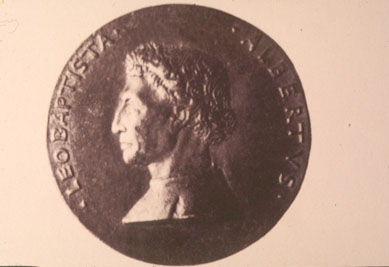
Slide 13-47: Alberti Medal

Slide 13-48: Medal of Vittorina da Feltre by Pisanello. Levey p. 75.
Here is an example of the Renaissance Portrait medal, objects inspired by antique Roman coins, but purely commemorative. Its greatest practitioner and virtual originator of the Renaissance medal was Pisanello (Antonio Pisano, active c. 1415-55).
The typical design had a profile portrait on obverse, another design on reverse, and an inscription around rim.

Slide 13-49: Alberti Medal Verso
On the reverse side, an allegorical allusion or an emblem could portray mental characteristics or the essence of the person portrayed on the obverse. For example, the reverse of the medal of Marsilio Ficino, the great Florentine Platonic philosopher, bore only the single word, Plato. Medals often bore the family Impressa, a kind of trade mark, logo, or insignia, like the winged eye on the reverse of the Alberti medal.
Michael Level writes, "At once a new artifact but with antique echoes, personal, naturalistic and yet allusive, easily portable yet particularly durable, the portrait medal is a perfect symbol of Renaissance endeavor and achievement."
Here, a few inches of metal held the promise of eternity. It is a perfect example of the Egyptian definition of the word sculptor, one-who-keeps-alive.
Ovato Tondo or Elliptical Format

Slide 13-50: Prud'hon, c. 1803
Arnheim says that the Renaissance cherished the circle as the shape of cosmic perfection, the Mannerist and Baroque periods favored the ellipse.

Slide 13-53: A Cameo
The upright ellipse was good for portraits. According to Arnheim, A ... for the portrait, the oval lends welcome assistance in the painter's struggle with the human figure, which carries the head high above its center. The upper focal point of the ellipse offers the head ... a compositional resting place not available in either the tondo or the rectangle."
In US currency, Presidents are in elliptical frames. Also note ellipses around the numerals on $1, $5, and $20 bills; elliptical frame around Lincoln Memorial on $5 bill.
Summary
We have briefly tracked the development of paintings from
... no frame, as in cave paintings ...
... open frames, as in the frieze ...
... and multiple frames, often showing a time sequence
... and the altarpiece.
We have mentioned four reasons for the closed frame ...
... to separate the world of the picture from the rest of the world
... to control the composition of the picture
... for portability
... as a window frame through which we see the world.
We've seen that the emerging art market required portability, which encouraged the use of canvas, which in turn may have led to the use of the rectangular format.
And have explored several rectangular formats; the square and the overlapping square, and have seen that the Golden Rectangle was not a big deal in art. We have seen how some artists have used axes of symmetry, zones, diagonals, and microthemes for compositional purposes.
We then explored the round format, in painting, sculpture, and medallions, and the ellipse.
Reading
Arnheim, Power of the Center, pp. 51-71.
Bouleau Chapter II, The Frame. pp. 30-47
J. Burchardt, The Altarpiece in Renaissance Italy (1898), ed. and trans. P. Humfrey, Oxford, 1988, p. 81.
Pope-Hennessey p. 192-222
Levey, Early Renaissance, p. 73-77
Review of The Altarpiece in Renaissance Venice, Art Bulletin, March 95, p. 139.
